The retail world is fiercely competitive and standing out on the shelves is a constant challenge.
It is the packaging that plays a key role in presenting the brand values of the product and for a luxury brand, which differentiates itself on quality and image, the importance of the packaging is intensified. Luxury brands rely on packaging to cultivate an image of high quality, elegance and sophistication for their products.
CHOOSING THE RIGHT MATERIAL
There is a material and a new technology for every occasion but choosing the right combination to create excitement on the retail shelves is not straightforward.
Amongst many different packaging types used in the luxury world, steel is gaining more and more ground because of the unique benefits it can offer, including advanced shaping performance and a multitude of decorative finishes, embossing and debossing, where an image or shape is depressed into the material so it sits below the surface.
See Also:
Indeed, the opportunity for creativity has never been so dynamic, hence why many famous whiskey, cosmetic and confectionery brands opt for steel as their packaging medium, taking full advantage of the numerous technologies available.
How well do you really know your competitors?
Access the most comprehensive Company Profiles on the market, powered by GlobalData. Save hours of research. Gain competitive edge.

Thank you!
Your download email will arrive shortly
Not ready to buy yet? Download a free sample
We are confident about the unique quality of our Company Profiles. However, we want you to make the most beneficial decision for your business, so we offer a free sample that you can download by submitting the below form
By GlobalDataAlthough APEAL cannot showcase all examples, we now present the latest, most striking ones recently to dazzle our retail shelves.
SPECIAL DECORATIVE FINISHES
As well as shaping, advances in decorative technologies means that steel packaging can achieve a wide range of creative decorative finishes, such as crackle effect, mirror effect, colour-change, matt, sparkling, soft-touch, perforation, mesh and holographic effect.
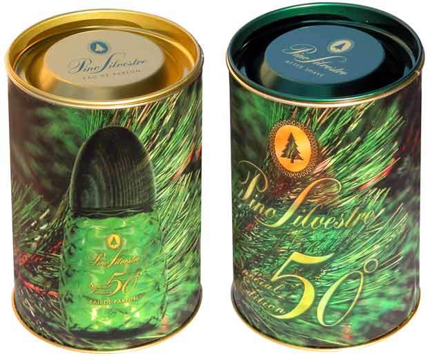
One example is lenticular, a unique printing technology that allows the vivid illusion of movement, morphing, and three dimensions to be portrayed onto a 2D printing surface.
In Spain, Envases Metálicos Eurobox have been using the technique for the last 3 years and have successfully applied novel lenticular finishes to metal for a range of spirit brands, among which Nicolas Feuillatte, Baileys, Absolut Vodka, Jameson and J&B, in addition to international cosmetic manufacturer Intercos.
They have recently produced a striking can with lenticular finish for eau de toilette and aftershave to commemorate the 50th anniversary of the Italian brand Pino Silvestre. The can, which vividly evokes the pines of a christmas tree, proved very successful on the Italian market.
“Lenticular is a novel, eye-catching finish which can help create movement, differentiation and impact on the shelves,” says Rosana Devesa, Marketing and Publicity Manager, Envases Metálicos Eurobox.
PERFORATION TECHNOLOGY CREATES PREMIUM EFFECT
Jean Paul Gaultier had already used a ‘classic’ steel container for the launch of its world-renowned perfume ‘Classique’, back in 1997, and subsequently for the launch of its ‘summer collection’ in a highly sophisticated decorated can.
For the festive season, Crown Speciality Packaging created a sleek steel promotional package delivering the exact high-end, upscale and stylish look required by Jean Paul Gaultier.
The 140mm x 200mm cylindrical steel packaging features cutting-edge asymmetrical perforation with designs such as snowflakes and Christmas trees.
The cans hold paired combinations of ‘Le Male’, ‘Classique Eau de Toilette’, ‘Classique Eau de Parfum’, and Fragile products, in a choice of pink, blue, silver, and gold with a matt finish. The cans feature four different sizes of holes, ranging from 0.7mm to 1.5mm in diameter.
Jérôme Gavinet, Product Manager at Beauté Prestige International comments, “Since the original launch of ‘Classique’ in a classic cylindrical food can, we continue to exploit the differentiation potential of metal packaging to present the Jean Paul Gaultier range.”
“Always setting the trends, we have made another leap forward with a unique steel box produced in a limited series. Our design concept was very challenging to produce, but in partnership with the can manufacturer, we’ve succeeded in bonding creativity with technology to deliver a real work of art.”
DEMONSTRATING VALUE THROUGH SOPHISTICATED PRINTING
Alongside the famous brands, other lesser-known companies are exploiting the excellent decorative finishes achievable with steel, to cultivate an image of quality for their products. Can-printing uses offset lithography allowing fine design details and interesting opportunities for special effects.
An exclusive steel ice cream can with decorations from Hans Christian Andersen’s fairytales, coinciding with the 200-year anniversary of the birth of the Danish writer, was developed by Glud & Marstrand for the small dairy ‘Is-mejeriet’ in Randers, Denmark.
Søren Guul of Is-mejeriet commented, “Our products are high-quality products made from Danish cream, and according to our customers, they taste great too. However, we are a small unknown dairy offering a new product, and you cannot tell that the ice cream is good just by looking at it when you see it in the counter of the shop.”
“We chose steel to underline the premium character of our products. We needed to communicate high quality and at the same time make consumers feel we are different from our competitors.”
“Steel is a material, when decorated, that can really get the attention of the shopper. It’s also a package that can have extended use, where the packaging stays around long after the product is consumed. We find this steel can so beautiful that we believe it could become a collector’s item.”
The decorative can “WØ Larsen 1864” manufactured for the famous Danish tobacco producer Orlik by German canmaker Klann Verpackungen has two distinguishing features – stunning printing and an exceptional lid design.
The can is decorated with a sophisticated combination of matt and glossy elements, and extremely fine lid embossing adds to the elegant appearance of this can. Instead of the traditional can with inward or outside curls the ‘Klann Premium Lid’ creates a container with seamless design areas between lid and body.
This not only enhances the excellent visual characteristics of the design but also increases the perceived value of the packaging.
A ‘MUST TOUCH’ FEELING FOR THE CONSUMER
Embossing and debossing provide alternative ways of enhancing the high-quality look of a product, by emphasising specific items such as logos and brand names for example. Also, perfectly fitting, detailed embossing on both lid and body not only give higher value and secondary use but also encourage a ‘must touch’ feeling for the consumer.
This is the case of the eye-catching ‘Fruit and Vine’ embossed decorative biscuit can which was created by Churchill’s Confectionery, specialists in beautifully packaged gift confectionery with high decorative value.
The tin is typical of the ‘Tiffany’ style, with colourful fruits printed on the can in a painting-like quality and embossing around them to imitate lead framing.
“We believe that visual impact and contents that taste good are equally important, that’s why so much care and attention goes in to designing attractive packaging to pack our high-quality products, to provide that special gift that can be treasured afterwards. We recognise the aesthetic advantages of steel packaging and its ability to convey a message of value,” says Stephen Oliver, General Manager, Churchill’s Confectionery PLC.
INNOVATIVE MATERIAL COMBINATIONS
In addition to forming steel into interesting shapes, some luxury brands pair innovative materials for a look that differentiates. One recent example is for Otard Cognac, who has launched a new metal can for its VSOP product every year for the last fourteen years.
The latest can features ‘Silktouch™ paper’ which was literally adhered to the surface of the metal. Eleonore Routoulp, Marketing Manager for Otard explained that the objective was to continue the tradition of using metal cans, but to create a new look and to bring it up to date.
“The originality of the can is in the daring combination of materials and colours. We kept the traditional aspect of the metal but wanted to create an element of surprise by combining it with a different material, silktouch paper. To the same end the contrast in colours used – the acidity of the orange colour mixed with the reassuring grey and green colours.”
As we have seen, steel offers designers a wealth of opportunities in terms of packaging design. Can manufacturers, brand marketers and designers are working hard to push the limits of metal manufacturing.
With increasing disposable income worldwide, the demand for luxury products is growing, leading to fast growth in the sector, and steel will continue to bring elegance, individuality and increased value to premium products.
LUXURY SHAPING
Progress in shaping technology has given designers additional scope for creative shapes, and brand owners the means to transform the ordinary into the exceptional.
J&B for example have launched a new, truly innovative packaging – Twist 2005. The main technical challenge for this can consisted in getting a twist effect into shape of the can.
During its development, technicians at French canmaker Virojanglor concentrated their efforts on controlling the effects linked to the ‘twisted’ drawing of the steel material.
The maximum expansion of the metal had to be calculated to avoid any risk of default or even minimal deformation during mass production. Certain steps of the process required a precision of ±0.002mm.
But the most difficult element in the process was the making of the lid. The original shaping of the contours of the letters ‘J&B’ required rigorous manual intervention. Over 40 steps with specially developed high precision tools were necessary to obtain that original twist effect.
Clémentine Giaconia of R’Pure, designers responsible for the project commented, “Creating an object for a brand like J&B, it’s developing the energy of the image by bringing new perspectives. Drawing inspiration from the vitality of contemporary graphism, the beauty of the can is in its lines of tension, the dynamics between the brand symbol and the synergy of the shiny and satin metallic effects.”


