The babycare category can be written off as garish and confusing by consumers, a perception that led Kimberly-Clark to completely overhaul the packaging design of its entire Huggies range. The redesign, which is the brand’s first for eight years, launched in April and the market will see an increasing number of new-look products released as 2010 continues.
According to Carrie Stanley, project lead and European marketing manager for brand communications at Kimberly-Clark, the company’s ongoing consumer research consistently pointed to the fact that many found the Huggies portfolio “unclear and undifferentiated”.
Go deeper with GlobalData

“We therefore decided to create a new visual identity for the brand and redesign all the packaging for our nappy and baby wipes ranges in order to create stand-out on-shelf and engage with our target audience,” she says. “As part of this we wanted to create more differentiation across the range and to ensure that every product embodied the emotional values of the Huggies brand.”
These values are based around the promise of offering ‘real-world solutions’ to mothers who want to make the most of everyday moments with their baby. Part of Kimberly-Clark’s objective was to have a greater impact on consumers browsing the shelves, and the Huggies logo has, therefore, taken on a greater role in the new packaging.
“This reinforces our brand impact, acting as a signpost for mum,” Stanley notes. “The Huggies redesign is also part of Kimberly-Clark’s ongoing investment in our key brands, and it reflects our recognition of packaging as a highly valuable consumer touch-point that drives awareness, engagement and purchase.”
See Also:
Simple and bold
How well do you really know your competitors?
Access the most comprehensive Company Profiles on the market, powered by GlobalData. Save hours of research. Gain competitive edge.

Thank you!
Your download email will arrive shortly
Not ready to buy yet? Download a free sample
We are confident about the unique quality of our Company Profiles. However, we want you to make the most beneficial decision for your business, so we offer a free sample that you can download by submitting the below form
By GlobalDataNo redesign is without its challenges, particularly in the complex nappy category. “It is difficult to provide the right product for every baby; as their needs change, there must be different solutions available on the market,” Stanley explains.
“Our greatest challenge was, therefore, deciding how to create a simple and bold range that would work across all of our products to reinforce the Huggies master-brand, while also differentiating each product so that mum could easily identify which products she needs to buy.”
The use of striking baby photography was key to achieving this.
“The images capture a snapshot of mum’s real world, just as if mum had taken the picture herself,” says Stanley of the images on Huggies’ new packaging, which all feature a baby looking straight at the camera.
Kimberly-Clark also had to take into account that each Huggies sub-brand had its own positioning and unique selling point. “Each sub-brand has its own icon and title to reflect and boost what distinguishes it from the other products in the range and bring out its own individual personality,” Stanley remarks. “We believe we cracked this challenge and the resulting look is one that is clear, confident and relevant, showing our customers that Huggies can reassure and support them throughout the journey of parenthood.”
For Stanley, the babycare marketplace had become very ‘me too’ with little to distinguish products and own labels using similar category codes to the sector’s big brands.
“It was interesting that consumers felt the overall look of the sector was garish,” she says. “It was clear that in order to differentiate ourselves we had to create a look that was not only simple, but also contemporary and appealing to mums.”
The repositioning and redesign of the entire Huggies portfolio was an important strategic task for the brand, so Kimberly-Clark was committed to finding the right partners to collaborate with.
“It was clear to us that the leading design agency we decided to work with was the right company for the job,” Stanley says, adding that its understanding of the marketplace, its strong creativity and rigorous processes meant they could generate a design that would be appealing to modern mothers.
Fun icon for Huggies redesign
Intended to make an emotional connection with mum’s real world, the redesign of the Huggies logo was an important part of the project. “The child’s hand splat icon injects an element of fun, and demonstrates that Huggies understands and supports mum throughout her children’s formative years,” Stanley notes.
Moreover, the previous logo used the brand’s corporate colour, red, and was, therefore, limited in its flexibility. With the new identity, the logo is flexible enough to work with the many different personalities embodied in the sub-brands as well as remaining consistent across the entire range.
A clean, contemporary look was also essential in creating ‘stand-out’ in a cluttered sector.
“The fantastic, distinctive photography and the simplicity of the pack architecture makes the shopping process much easier and clearer and engages consumers on an emotional level,” says Stanley.
Indeed, Kimberly-Clark wanted to make it as easy as possible for consumers to make the right decision when buying babycare products, something which resulted in the brand name and nappy sizes becoming much more prominent on the new packaging.
“By enlarging the logo on pack, making the nappy sizes more prominent and also using babies and toddlers whose age and stage reflect that of the baby for whom each product has been designed, we make it much simpler to connect with mum and draw her to the right product for her baby,” Stanley explains.
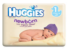
The first products in the range to be re-launched were the Huggies newborn nappies packs and Huggies wipes ranges, both of which use a natural colour to reflect the values of gentleness and purity associated with a newborn baby.
“This supports the product claims of ‘with organic cotton’ and ‘gentle cleaning like cotton wool and water’,” Stanley says, noting that the newborn baby featured on the pack wears a soft coloured hat, creating a memorable and engaging image.
Since then the Huggies Little Walkers step-in nappies have been released and the brand’s Natural Fit nappies and Superdry nappies are next on the list.
“It’s very exciting for us – as each product launches, the Huggies brand story strengthens,” Stanley says. “And, with research showing us that shoppers are responding very well to our fresh, modern look and increasing purchasing intent as a result, it can only bode well for the future.”