With so much choice available, brand managers are constantly striving to breathe new life into an established product and increase customer awareness through re-branding campaigns.
Go deeper with GlobalData

Yet, according to a March 2013 report from PRS Research, only 50% of new packaging designs actually succeed in the marketplace, most often due to simple lack of research and inadequate package testing.
The reality is that pulling off a redesign is not easy, and requires both inspiration and an acute awareness of current trends. So what works and what doesn’t? To find out, we compared two notorious rebranding campaigns – one that worked, and one that didn’t.
Tropicana – a lesson in how not to do a package re-design
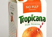
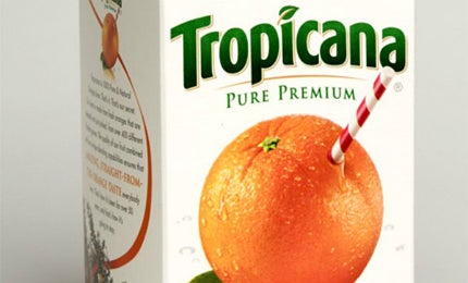
In 2009, Tropicana’s re-packaging of its orange juice had consumers foaming at the mouth. Gone was the unique, immediately recognisable branding, in its place a generic white and orange carton that looked almost indistinguishable from any supermarket’s cheaper ‘own brand’ of juice. The famous orange had become nothing more than an oddly shaped squeeze cap.
The tone of voice failed to engage, while the typography (Avant Garde) looked like it was trying too hard to be hip with its use of lower case. Ditto for the washed-out colour palette.
How well do you really know your competitors?
Access the most comprehensive Company Profiles on the market, powered by GlobalData. Save hours of research. Gain competitive edge.

Thank you!
Your download email will arrive shortly
Not ready to buy yet? Download a free sample
We are confident about the unique quality of our Company Profiles. However, we want you to make the most beneficial decision for your business, so we offer a free sample that you can download by submitting the below form
By GlobalDataConsumers flooded blogs and message boards with their ire, with cries of “ugly” and “stupid”. The guilty culprit, design and branding company Arnell Group, slunk away to the Macs to give it a re-think. Pepsi (Tropicana’s owner) admitted defeat and only three weeks after the launch, announced they would re-instate the beloved straw in an orange motif. Pepsi had paid Arnell an alleged $35m for this non-re-design, having chosen them over Sterling Brands.
Pepsi’s CMO at the time, David Burwick, conceded their packaging and branding refresh strategy had backfired: “Sometimes you land in a great place, and sometimes you don’t. And when you don’t, you need to find a better place. Fast.” He resigned soon afterwards, amid a nine percent revenue decline for the company’s beverage division in that first quarter.
Innocent – a product repackage per excellence
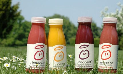
Innocent – the ‘superbrand’ creator of fruit smoothies, yoghurts and vegetable pots – has enjoyed incredible success. Born out of a London music festival back in 1999, Innocent is now a worldwide brand with annual turnover of more than £130m.
Despite majority shareholding by Coca-Cola, shoppers still have a strong emotional connection to the brand and its ‘natural’ ethos. The company cite the talents of David Streek, former design director at now-defunct Deepend, with creating the company’s original logo and brand identity.
Five years after its initial launch, facing increased competition in the smoothie market, Innocent hired Pearlfisher to improve “shelf stand-out, range consistency and impact” throughout the brand. With a strong background in re-positioning food and drink brands, Pearlfisher recognised the emotional appeal of the naïve Innocent dude and halo logo, factors that made the brand so iconic.
Creative partner, Jonathan Ford, recalls: “Our job was to help sort them out after five years of explosive growth,” Ford says. “It had started with a couple of smoothies, but visually was becoming a bit of a mess and we wanted to take the good stuff they had created themselves and make it look consistent and make it more desirable.”
They successfully achieved this with subtle design and packaging refinements. The Innocent name was given a backseat, with more emphasis on the smiley face ‘dude’ by placing him centre stage and introducing a proper halo. Bottle caps switched back to white, to reinforce the idea of purity and naturalness, while the flavour descriptor was given colour to bring it to life. Typography became less generic to raise impact and keep priorities of communication clear.
“The design had to reflect what the packaging should not be – contrived or trashy – and we didn’t want to use any graphical tricks,” said Dan Germain, head of Innocent’s creative team.
The three main concepts that had to be embodied in the refresh were: hone-made, natural-looking and a bit posh. One of Innocent’s ways of engaging with its consumers is via wording on the back of the bottles, encouraging shoppers to connect via the Banana phone. An inspired use of advertising space on packaging.
Innocent was voted the “most admired brand” for sustainable packaging in an easyFair February survey in 2013. Their MD Matt Benyon said: “It shows how Innocent gets things right in not only the green packaging side of things, but conveying their green message across to its peers and consumers.” Innocent’s cartons are made from 100% Forest Stewardship Council-certified material, and its bottles are created from food grade recycled plastic.
The five main reasons cited for the lack of re-branding success are:
(Courtesy of PRS Research)
1. Unnecessary re-design. Product honchos, it seems, tire of their packaging before customers and base the changes on their own hunches, rather than the results of targeted focus groups.
2. Insufficient innovation and / or impact. Packaging is hard to differentiate between other brands, lack of congruence between packaging and design and on-pack messaging (POCs – priorities of communication). Added benefits were not sufficiently highlighted or forgotten.
3. Solving the wrong problem. Incorrect changes made due to unawareness of shoppers’ real issues with the product.
4. Creating unfamiliarity and confusion A p.roduct’s “core design equities” (familiar features) were not respected. In essence, disruption and continuity were out of balance, which turns off consumers.
5. Full packaging harmony. The shopper needs to recognise the product they take home is the same as marketed in packaging and points of sale. Ugly or hard-to-use packaging is often avoided. They also suggest that engaging new shapes and materials in re-packaging actually have more impact than design-only changes.
Related content
Ahead in the cloud: PantoneLIVE revolutionises brand colour management
Standardising brand colour integrity on all substrates for all printing processes, across the entire workflow, from design concept to retail store shelves, has long been the Holy Grail for the packaging sector – now the PantoneLIVE programme may finally have made it a reality.
Vanishing packaging: the trend for dissolvable materials
From iPod wrappers to chocolate trays, dissolvable packaging products are appearing in increasing numbers.