Packaging is changing every day; as products become more popular there is a demand on manufacturers to reinvent their packaging to meet consumer demands. Packaging has evolved in the last couple of decades, looking at brands including Coca-Cola, Heinz and McDonald’s we are able to see how simple changes in packaging from the earliest designs to the present day can change the outlook of a company’s brand and make it more appealing for consumers.
Coca-Cola
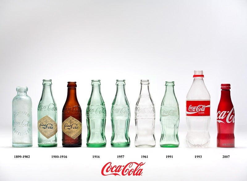
Looking at the earliest design of the Coca-Cola bottle in 1899 you can see that it is a simple design with a transparent bottle and the Coca-Cola name on the front of the bottle. In 1888, the Coca-Cola Company was purchased by Asa Candler; he then announced in the annual report of 1895 that Coca-Cola was sold and drunk in every state and territory in the United States, with Chattanooga being the first city to bottle Coca-Cola under a new contract.
Go deeper with GlobalData

As you can see, from 1900 to 1916 the diamond-shaped paper label was introduced to the Coca-Cola bottle; at this time the company started being in association with athletes in a number of advertisements.
Jumping forward a century or so to the present day, there is a notable difference in the Coca-Cola bottle with the new design being a celebration of the Coca-Cola bottle turning 125 years old in 2011. The shape of the bottle has changed quite substantially, from straight to the contour shape. The shape of the bottle was changed as, at the time, competitors were trying to imitate Coke, therefore the Coca-Cola Company asked manufacturers to design a shape that was distinctive enough that it could be recognized by feeling it in the dark or lying broken on the ground.
Heinz Tomato Ketchup
Heinz Tomato Ketchup was launched in the UK in 1886 and is celebrating its 150th anniversary this year. Heinz started a condiment company that grew to other products including Heinz beans and Heinz tomato soup. 
Looking at the earliest image of the Heinz tomato ketchup bottle, the labelling of the product is only on the front with the word ‘Tomato Ketchup’ in capital letters and bold font. As well as this, the Heinz logo is located on the labelling but is not as prominent as the name of the product. The shape of the product is ridged and has a bottleneck shape leading to the top of the product.
How well do you really know your competitors?
Access the most comprehensive Company Profiles on the market, powered by GlobalData. Save hours of research. Gain competitive edge.

Thank you!
Your download email will arrive shortly
Not ready to buy yet? Download a free sample
We are confident about the unique quality of our Company Profiles. However, we want you to make the most beneficial decision for your business, so we offer a free sample that you can download by submitting the below form
By GlobalDataOver time, the product has changed but also kept some of the features seen on the older product. The labelling is still in the same shape but the edges have become rounded, this new version of tomato ketchup also has an image added to the labelling and placed both the product name and the Heinz logo in bold block capitals. The colour of the present day product is a darker red than the past products and uses white labelling to enhance the colour of the bottle.
McDonald’s takeaway
McDonald’s has made many changes to its packaging throughout the years, all while retaining the signature ‘M’ imagery.
 Looking at one of the earlier designs from 1995, which features the golden arches for the ‘M’ of McDonald’s, all of the packaging is made from paper and cardboard. Without any other labelling, the golden ‘M’ serves as the prominent image on the packaging; additionally, the bright red and yellow colours have seen an ongoing usage that consumers would link back to McDonald’s.
In 2016, while the fast food retailer still retained its brown packaging with the yellow ‘M’ for takeaway bags, the word ‘McDonald’s’ was added on the opposite side of the packaging and the ‘M’ is not as defined as it was in the 1995 designs. There also seems to be a more simplistic style to the present day design, with fewer colours being used on the packaging; where you can see bright red and yellow on the older packaging, the present day design uses a lighter yellow and a pastel purple to display the name of the fast food chain.