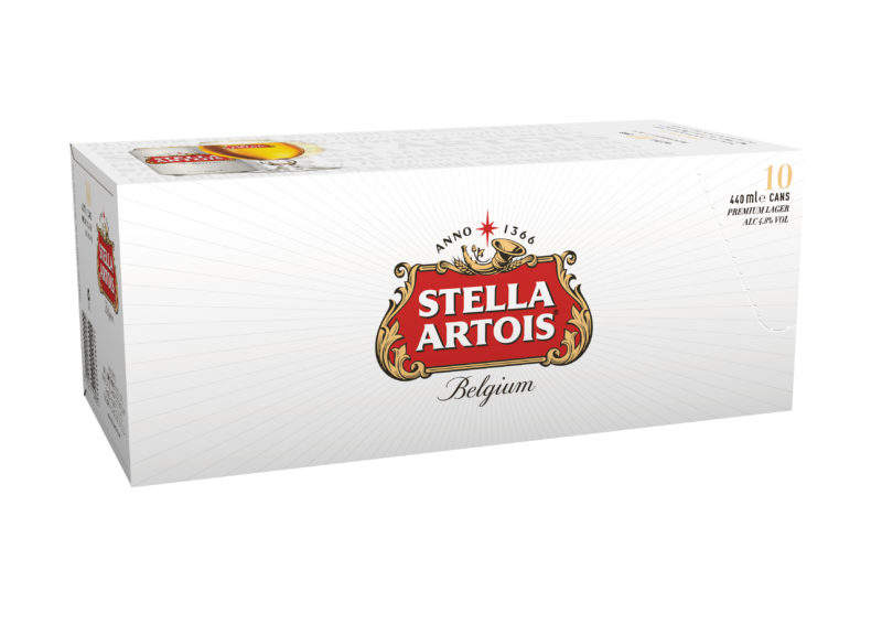
Belgian brewing company AB InBev has unveiled a new packaging design for Stella Artois to reflect the beer brand’s heritage as well as a modern look.
The new packaging, which is set to hit the UK shelves in the coming weeks, was developed in partnership with global brand design agency Jones Knowles Ritchie.
Go deeper with GlobalData

The redesigned bottles comprise a redrawn logo adapted from its original, historic form, which pays tribute to the brand’s 600 years of Belgian brewing heritage.
Other significant features include the eight-pointed Stella Artois star, which continues to be a key part of the brand persona.
New ‘rays’ have been added to the star in a bid to draw attention to the emblem and bring a contemporary feel to the cans, bottles and packs.
Stella Artois Europe marketing director Alexis Berger said: “We are incredibly proud of the new direction the brand aesthetic is taking, highlighting our Belgian heritage but also modernising Stella Artois to lead consumers’ expectations of premium.
How well do you really know your competitors?
Access the most comprehensive Company Profiles on the market, powered by GlobalData. Save hours of research. Gain competitive edge.

Thank you!
Your download email will arrive shortly
Not ready to buy yet? Download a free sample
We are confident about the unique quality of our Company Profiles. However, we want you to make the most beneficial decision for your business, so we offer a free sample that you can download by submitting the below form
By GlobalData“We’re confident this refreshed design will stand out on shelves and highlight the qualities of Stella Artois which make us the UK’s favourite alcohol brand.”
AB InBev also introduced subtle typography placed behind hero imagery across packs.
The addition of watermarked text is aimed at infusing a classic Stella Artois feel with the more modern branding.
The packaging will also feature the product story that gives description about the history behind Stella Artois’ distinctive taste.
Each pack will also have ‘La Bière Fine de Luxe’ as a tagline, which the brand used in the past.
Furthermore, Stella Artois has added a second perforation to the neck label of bottles to make sure the paper wrapping does not touch the lips.
A matte finish will also be added to cans starting next year.