
The packaging industry thrives on innovation, driven forward by fresh new ideas. Even the most staid and traditional sector can be reinvigorated by a new packaging concept, or a tweak to an existing concept that proves to be enough of a step forward.
The importance of encouraging new ideas to flourish imbues international awards with greater significance. Far from simply being exercises in mutual back-patting, packaging design awards recognise the companies that serve as the industry’s engine room for innovation.
Go deeper with GlobalData

Discover B2B Marketing That Performs
Combine business intelligence and editorial excellence to reach engaged professionals across 36 leading media platforms.
The iF Packaging Design Awards were launched as an annual competition in 2008, joining the list of other design awards run since 1954 by the Hannover-based International Forum Design (iF) and its parent organisation, design promotion company iF Industrie Forum Design Hannover. Since its launch in 2008, the winners of iF’s packaging awards have been announced at the Interpack conference in Düsseldorf.
The iF Packaging Design Awards 2011
This year, 59 submissions from 114 competitors and 24 countries, divided into six categories (sales packaging, display and transport packaging, packaging graphics, packaging materials, packaging machines and packaging concepts) were honoured with an award decided by a jury of five top international design experts.
The jurors included the likes of Interbrand’s chief creative director Andreas Rotzler and Folke Schlueter, Procter & Gamble’s principal design manager of global cosmetics. Winning packaging ranged from Swiss fashion brand Strellson’s bold, minimalistic men’s fragrance packaging, designed by Peter Schmidt, to safety-enhanced radiolucent silver foil cardboard packaging by Karl Knauer.
The jurors noticed clear trends for eco-friendly designs, as well as aesthetic economy.
“Packaging doesn’t necessarily mean a waste of resources and materials,” they said. “Simply cutting down doesn’t always bring the best results, but you can clearly see that there is a real effort to develop environmentally friendly packaging. The winning products often achieve their results because they’re based on a minimalistic idea. They really are extraordinarily good and above all simply and clearly designed.”
Among the winners, five entries in particular were judged to have achieved an exceptionally high standard and were honoured with prestigious iF Gold Awards. These companies and their products are listed below.
RedCube: a pocket-sized packaging printer
The iF Packaging Design Awards recognise functionality as well as pure design, especially in its packaging machines category. One system from this category – Swiss printing specialist Hapa’s RedCube printer – received the award’s highest honour this year. A UV DOD (drop on demand) inkjet printer that can be integrated with packaging machinery, RedCube prints a standard 36mm width and is able to meet the high printing demands of the pharmaceutical industry. The printer is also compatible with the latest track and trace, serialisation and anti-counterfeiting technologies that are such a priority in today’s pharmaceutical supply chain.
Functionality doesn’t have to exclude form, however, and RedCube was also praised for its diminutive size – the equivalent of a single TetraPac, according to Hapa – and sleek red finish. “The functions are obvious and clearly arranged with smooth, and therefore hygienic, surfaces,” said the judges. “Although the machine has been reduced to the essentials, it displays a really special character.”
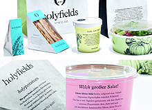
Holyfields’ heavenly take-away packaging
Packaging graphics can often be dominated by intense, attention-grabbing work that is designed to draw the consumer’s eye on busy store shelves. But the only packaging graphics entry to win an iF Gold Award in 2011 was a subtle, predominantly pastel-coloured set of take-away food packaging for German restaurant chain Holyfields.
Designed by Hamburg-based graphic design firm Loved, Holyfields’ packaging for its eat-out menu emphasises creating a stronger connection with customers through welcoming colours, informative text and hand-crafted sketches that could have come out of a Victorian-era illustrated novel.
The jury was impressed, hailing it “a new concept that clearly differentiates itself from mainstream fast food restaurants and a very coherent concept that is even carried through to the packaging.” The judges continued, “Colourful, inviting, informative: photos with hand-painted illustrations and small informative explanations create a harmonious whole, inviting you to read and linger.”
Small tweaks with OptiLift
OptiLift, one of the three sales packaging entries to win a Gold Award this year, proves that even the simplest idea can be a winner, provided that you’re the first to think of it. Conceived by Irish packaging company Ardagh Group in collaboration with Impress SA Centre R&D de Crosmières in France, the OptiLift easy-open metal can-end has the potential to make opening cans easier for millions, with no more than a slight indentation in the top to allow the opener’s finger to slide easily under the ring pull. As well as its iF victory, OptiLift was also named one of Interpack’s top ten highlights.
“An indentation for your finger underneath the tab makes it really easy to open cans: a simple and efficient design solution,” said the jury. “This simple design feature enormously increases the functionality of the packaging, without increasing costs. Simplicity in its essence. Wonderful.”
Gize water bottles: elegance and ergonomics
Gize’s glass bottle was another German-designed Gold Award winner for 2011 (four of the five winning entries were designed in Germany, which has evidently become a European focal point for design talent). The Canadian Mineral Water Development’s upmarket mineral water brand required suitably elegant presentation, and advertising agency Zweipunktnull did not disappoint.
“Gize’s entry benefits from extremely modern typography and a clear design,” said the judges. “This aesthetically pleasing glass bottle, used for high-quality water that is available in several different flavours, really won us over. The bottle’s slim waist makes it fit perfectly in the hand.” With a minimalist design and a nonchalant sense of style, Gize’s water bottle designs are a perfect representation of Zweipunktnull’s statement on its website: “Does it always have to be a hard sell? Why not persuade with a soft approach and understatement?”
Judges go wild for the Wild Bag Box
The Wild Bag Box was conceived by design group Identis as packaging for a range of bags inspired by wildlife road signs from around the world. To package these wild beasts, Identis came up with a cardboard-based concept that keeps the bags safe but displays the animal design through rows of bars in the middle of the box. This, according to Identis, “makes the Wild Bag Box so much more than just packaging. It becomes part of the story and affirms the vitality of the products.”
The jury agreed: “The wild animals on these bags are kept in check thanks to the packaging. The product is partly visible while also being protected. The borderline between packaging and contents is blurred. Let’s hope that there will be more of this kind of packaging design in the future.”
