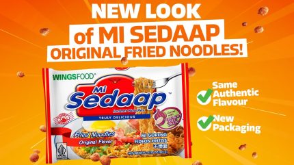
Asian noodle brand Mi Sedaap has introduced a refreshed packaging design for its Original Fried Noodles, aimed at enhancing its visibility in US retail channels.
This updated packaging is intended to strengthen the brand’s connection with international consumers and reportedly emphasises its commitment to quality and innovation.

Discover B2B Marketing That Performs
Combine business intelligence and editorial excellence to reach engaged professionals across 36 leading media platforms.
The new packaging features a modern aesthetic with bright colours and a dynamic layout, making it easier for consumers to identify the product.
Multilingual labels reflect the brand’s Indonesian heritage while a clearer information layout simplifies the shopping and cooking experience.
Key features include colour schemes representing the Mi Goreng flavour, prominently displayed halal certification, and an ‘export quality’ badge to build consumer trust.
The product name and tagline have been modernised to ‘Truly Delicious’ in English for better international recognition.
Enhanced food photography showcases the noodles’ texture and quality, focusing on freshness and flavour, according to the company.
The refreshed packaging is expected to enhance visibility in both retail and online environments, including Asian grocery stores such as 99 Ranch Market and H Mart, as well as major e-commerce platforms such as Amazon and TikTok Shop.
The new packaging began its rollout in March 2025, with full nationwide availability anticipated by the fourth quarter of this year.
Mi Sedaap was founded in 2003 as a brand under Indonesia’s Wings Group.
Distributed by Jans Enterprises in the US, Mi Sedaap is integrating into mainstream grocery channels.
Jans Enterprises CEO Anthony Kartawinata said: “At Jans, we’re proud to unveil the bold new look of Mi Sedaap Original Fried Noodles in the US – a fresh design that reflects our commitment to quality, innovation, and unforgettable flavour.”


