
Deborah Williams: How is colour used in packaging and why is it important?
Mark Starrs: Packaging is an opportunity for brands to communicate their identity with consumers and colour plays a significant role in this. When executed effectively, coloured packaging can make a brand instantly recognisable, sparking emotion and creating meaning in the minds of consumers.
Consider companies such as Tiffany & Co., whose teal-coloured packaging has become synonymous with fine jewellery around the globe. Or Selfridges, for example, whose bright yellow carrier bags have become notorious on the UK’s high streets as symbols of British luxury and fashion. These brands have effectively used coloured packaging to express their individuality and values. Colour has been used as a powerful tool to stand out.
Go deeper with GlobalData

Discover B2B Marketing That Performs
Combine business intelligence and editorial excellence to reach engaged professionals across 36 leading media platforms.
DW: As a company that specialises in paper-based solutions with an on-site colour lab, colour clearly plays a large role in your work. How has James Cropper’s relationship with colour evolved over the years?
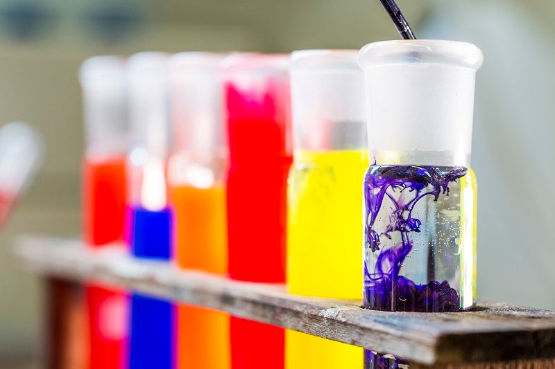
MS: It’s incredible to look at how far we’ve come since James Cropper started in 1845. Back then, we were a company manufacturing a small selection of coloured papers for wrapping groceries and other goods for Britain’s burgeoning retail sector. Now, we have become famous for pushing the boundaries and innovating with colour. Our colour lab hosts over 4,000 live shades and our in-house database has access to over 200,000 different shades.
With this in mind, the opportunities for brands who want something unique are endless. Our Tailor Made service allows brands to indulge their wildest creative impulses – choosing their very own colour, texture, feel or technical requirement – and we will make a bespoke paper just for them. Take the Royal British Legion, for example, who approached our team with the desire to switch from creating Remembrance Day poppy petals out of fabric to a recyclable paper. We created a bespoke coloured paper with intricate technical details; lightfast, colourfast and retains its shape after being stamped into poppies that are instantly recognisable. And we have been supplying the paper to them for forty years.
Additionally, our latest innovation COLOURFORM has pushed our colour capabilities into the world of sustainable moulded packaging. Forget the idea that sustainable packaging is limited to brown cardboard and consider the fact that COLOURFORM packaging, made from renewable and recyclable moulded fibres, can come in any shade desired.
I think it’s also important to note that our progress with colour has been one of our company’s core values since the beginning. We have been lucky enough to have generations of colour expert’s work at James Cropper, passing on, expanding and evolving our knowledge base over many years.
DW: How are colour trends in packaging predicted and how has the method changed over time?
MS: Our Progressive Palettes findings show that fashion has historically been the undisputed champion of style, inspiration and colour trends. We have seen the season’s most colourful collections make their way from the catwalk into our colour lab, claiming a stake in brand identities and featuring in packaging.
Recently, however, a power shift has taken place. Social media has superseded the catwalk and become the number one influencer on colour choice for brands. Image-led social platforms such as Instagram are now leading the way in the design stakes and brands are embracing social networks to express their identities.
DW: What are your colour predictions for packaging in 2020?
MS: As society moves towards creating a sustainable planet, we’re seeing this reflected in brand briefs. Blues are dominating palettes, and turquoise and sea greens are proving to be just as popular, predominantly as a reaction to the current climate crisis. Interestingly, we’re also seeing a resurgence of brown and earthy, natural tones such as the beautiful new packaging for Burberry.
I would also anticipate that black will be a popular choice for packaging in 2020. It’s a common misconception that the colour black cannot be recycled, when in fact any coloured paper product is 100% recyclable. Cosmetics company Lush, a brand well-known for its sustainability credentials, demonstrated this when they chose to use black for their bath oils packaging, made by COLOURFORM.
DW: You recently released the James Cropper Progressive Palettes report. What goes into the curation of a colour report such as this?
MS: It took almost a year from the initial idea for Progressive Palettes to reach our final publication date. To begin with, we hosted a round table in London with industry experts across a range of sectors to discuss the current state of the industry, focusing on colour and packaging. The purpose of the round table would later inform the questions that we would ask a much wider selection of designers, including questions such as “what is influencing modern colour choice?” and “which industry sectors have the most identifiable colour palettes?”.
Following the round table, we took our findings and conducted research with over 500 designers across the UK, 200 of who were packaging designers, to investigate further.
The results were analysed and key findings were given to our original panel of experts, who created pieces of thought leadership based on their own experiences and understandings.
DW: The designers you surveyed for the report said the top five outside influences currently impacting the colour choices for brand identity and packaging are product sector, Brexit and the Trump era, the unboxing trend, sustainability and the gender debate. But what do you think is the most memorable past popular culture phenomenon/event that has shaped colour in packaging?
MS: Typically, during times of unrest, such as war or recession, society tends to drift towards using, buying and wearing ‘safe’ colours i.e. nothing that is going to stand out too much. However, once these periods pass, we see bright colours boom in popularity. The world needs bright colours to bring positivity after dark times.
DW: Brands such as Tiffany’s have been able to personalise the use of colour in packaging – making their brand recognisable all over the world with just one shade. What brands do you think are currently excelling at personalising colour in packaging?
MS: British retailer Selfridges is well known for pushing boundaries and setting global trends. In a pioneering environmental move, Selfridges began collecting used coffee cups from its retail stores and offices, for us to upcycle using CupCycling into beautiful paper for the store’s iconic yellow carrier bags. Through this move, Selfridges truly owns its packaging story. The vibrant yellow paper bags are instantly recognisable on the high street and reinforce Selfridges’ identity as a unique and forward-thinking brand.
Luxury brand, Burberry, has launched new sustainable packaging in partnership with CupCycling from James Cropper, after making the commitment to ensure all of its consumer packaging is reusable, recyclable or compostable by 2025. 40% of Burberry’s new packaging is made from upcycled coffee cups and features a textural surface design similar to the fabric used to make its iconic trench coats. In doing so, Burberry has created synergy between one of its most popular products and its packaging, seamlessly strengthening its brand identity for consumers.
DW: How can a brand choose the right colour to tell its story?
MS: A brand has to be careful in terms of which global market they’re targeting. Colours can have varying connotations around the world. The colour red, for example, is commonly associated with luck and prosperity throughout Asia, whereas it can represent love, passion or even danger in Western societies. So, it’s important that brands do their research.
The most effective colour choices for brands are those which are tied to a story. If the brand’s colour choice originates from heritage or history, this can help to give the brand personality. To ensure that we practice what we preach, James Cropper’s brand colour – Kendal Green – is tied to the rich history of the Kendal area, where our mill is situated. We sourced pigments from the original cloth manufactured in Kendal during the middle ages and brought it back to life in our colour lab to create a colour with meaning and character.
DW: The designers also predicted that technology will become the biggest influence on colour by 2030. What is James Cropper doing or planning to do to add to this particular prediction?
MS: James Cropper is an innovator. Over the last 175 years, our mill in the English Lake District has become renowned as an industry leader.
We’re also proud to work in an industry where collaboration is valued. Working with our peers ensures that as a collective, we develop change-making solutions and provide the best possible products for our consumers and the environment.
We work hard to ensure that we are forward-thinking in our approach to business. Take CupCycling, for example, which is the world’s first process to transform used takeaway coffee cups into high-quality paper, packaging and stationery products.
DW: What is the main lesson you have learned about how consumers respond to colour in packaging?
MS: The main lesson we have learned is that colour matters. Consumers want the ‘wow factor’ in their packaging and colour is key to creating that experience. One of the main aims for a brand is to create a connection, and ultimately loyalty, with their consumer. Colour is a means to do this, as it evokes emotion and triggers memories.
DW: What is the main lesson you want the packaging industry to know about colour?
MS: The main lesson we want the packaging industry to know is that any coloured paper product is 100% recyclable.
