

According to the Royal National Institute of Blind People (RNIB), braille has long been the most popular way for visually impaired people to read and write, yet in the world of packaging and labelling, braille is still surprisingly rare. It’s a problem all over Europe that can leave blind and partially sighted individuals to face a world of indistinguishable merchandise, having to rely on others to ensure they’re picking up the right product in the supermarket.
Go deeper with GlobalData

Discover B2B Marketing That Performs
Combine business intelligence and editorial excellence to reach engaged professionals across 36 leading media platforms.
In pharmaceuticals at least, braille is increasingly common. On 30 October 2005, Council Directive 2004/27/EC – Article 56(a) came into effect, meaning the 25 member states of the European Union were required to ensure all pharmaceutical packaging, whether over-the-counter or provided through health services, had to include braille on the box indicating the name and the strength of the medicine. Each state was given 5 years to ensure national legislation was in place. Producers are also required to ensure that further information is made available on request.
But for commercial products, the responsibility lies with the manufacturer, who in most cases chooses not to include braille at all. and it’s something that designer Alexandra Burling felt needed addressing.
‘Color Me Blind’ was Burling’s graduation project from Stockholm, Sweden’s Forsbergs School of graphic design and advertisement, and has garnered attention over its unique approach to the design of products that many view as everyday essentials, but to some highlight the disparity between the full sighted and visually impaired in the packaging sector.
A different kind of experience
“I wanted to make something that actually had a meaning behind it, not just something for my graduation,” says Burling, “I thought about how for graphic design, the main sense that you need to experience is sight, so thought ‘what happens if you remove that sense?’. Then I realised that there is already a group of people living with the problem.”
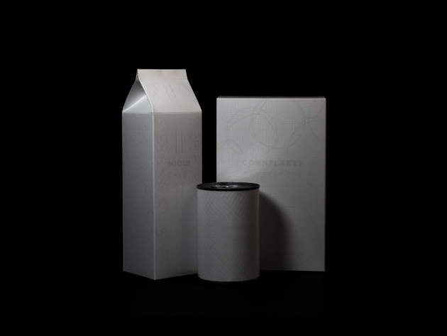
For Color Me Blind, Burling sought to create aesthetically appealing packaging for the visually impaired, focusing on three everyday items; a cereal box, a milk carton, and a tin of crushed tomatoes. The design went beyond the simple inclusion of a braille label however, with all three products featuring an enhanced amount of information, including ingredients, country of origin, and best-before dates. Dynamic patterns were also included to help a sightless person instantly recognise the item they are handling.
The Invisible Exhibition is an international art project that has held events in several cities around the world since 2007, hoping to demonstrate to fully-sighted people what life is like without what many feel is their most vital sense. Fortunately for Burling, at the time of her project, the Invisible Exhibition had recently opened up in her native Sweden, giving her the opportunity to interview the blind tour guides working on the event.
“After going to the exhibition I started realising that there is a real need for this. When doing my interviews I told the guides that I had the idea of packaging design specifically for blind people, and they said that it’s such a huge problem… I quickly realised that this area is very important. Food is critical for survival – and it’s not just about knowing what the product is in your hand, but also a matter of independence; going to the shop and buying your own food without the need for assistance,” she explains.
It’s a particularly pertinent point in Sweden, where unlike in many other European countries, the vast majority of supermarkets do not allow guide dogs inside their stores, meaning individuals have to rely on the help of others, or be accompanied by an aide on grocery trips.
Problems posed by everyday essentials
As to why Burling specifically chose cereals, tinned tomatoes and milk, she explains that these specific items all pose significant problems for visually impaired people. “I started out looking at products that cause problems because they resemble each other. The can of crushed tomatoes were just because there’s so many different cans. The milk carton could carry so many other things, like yoghurt, or the sour milk we have in Sweden. And with cornflakes, because it’s inside a box already, you don’t really know what’s inside.”
But the problems aren’t limited to the kind of product chosen. Specific sub-categories, such as skimmed, semi-skimmed and whole-fat milk, are even trickier to identify. This is particularly relevant when you consider potential food allergies, or diet choices such as vegetarianism or veganism. “I asked a blind woman which fat milk she preferred and she said if she could just get home with a carton of milk at all then she’ll be happy. She said she doesn’t have the privilege of asking herself which one she prefers,” comments Burling.
And for the additional information found on each packet, Burling wanted the textured patterns to represent the product inside. “I used the patterns in place of colour. You pick up the product and know what it is. On the milk carton, in the middle it has two straight lines, and that’s to indicate that its medium fat milk. Another problem is that you don’t always know where the opening is, so I made special symbols to highlight where you’re supposed to open it.”
No excuses for packaging providers
In the UK, the RNIB has named the Co-Op supermarket as a good example of a retailer using braille on its products to provide basic information to its customers, but the vast majority of goods in the UK and elsewhere in Europe are sorely lacking any sort of provision for blind persons.
A trap that retailers need to be careful of falling into is using braille to demonstrate to their customers that they cater to all people, but not using it appropriately or usefully. “For instance in the mall or outside shops, you’ll see the sign by the entrance with the name and their opening hours. Underneath you’ll see it written in braille. The problem is it’s very hard for a blind person to walk up and find that sign,” explains Burling.” A person I interviewed said it was an ignorant way of trying to show that you care about blind people, but it’s really only to show people with sight that they care, rather than actually helping anyone. If you can’t find the sign what’s the point?”
“I’d say the first step to be more inclusive is with food, because it’s such an important thing. I definitely think that other packaging should be designed for the visually impaired. There are even new ways of printing that are very effective and they don’t cost too much, so there’s no excuse.”
The lack of provision for blind and partially sighted people in the packaging sector is incredibly poor, and leaves many feeling forgotten. It’s a market that the vast majority of packaging providers overlook, but with over 2 million people living with a form of sight loss in the UK alone, it’s a frankly irresponsible attitude to ignore them.
