
Packaging plays a pivotal role in today’s ultra-competitive food retail sector. Innovative packaging and graphic design does more than make food products appealing to browsing customers.
Whether it’s making products friendly for children or friendly for the environment, good design makes an impact with consumers, building brand loyalty and creating an instant connection with the product inside.
Discover B2B Marketing That Performs
Combine business intelligence and editorial excellence to reach engaged professionals across 36 leading media platforms.
Here we cast our eyes over some of 2011’s best and brightest food packaging, from ergonomic designs to effective rebranding campaigns. In an increasingly sophisticated field, these projects have separated themselves from the pack.
ICA – a personal approach to packaging
When designing the packaging for the in-house brand of Swedish supermarket chain ICA, its designers decided to take a rather personal approach instead of creating a rational, anonymous and scientific design.
With copy written in a common, easy-to-understand tone and with personalised characters, the team at King Design created something far from the complicated technical information and design usually seen on healthier products lines.
"We wanted the product line to be real, more personal and foremost a real tasty choice," said the designers. "Therefore we created a healthy, playful world with characters and situations all connecting to a ‘healthy and good active life’ without being too rigorous, boring or ‘healthy is tasteless’."
The success proved them right: the products from the range Gott liv (Good life) are hugely popular among customers, meaning business and communication objectives have succeeded.
On top of that, the team won the Gold Design and Packaging Design award at the Cannes Lions International Festival of Creativity in 2011.
Waitrose speciality pizza range – capturing regional flavours
London and San Francisco-based design agency Turner Duckworth has been designing packaging for upmarket UK supermarket Waitrose for 15 years.
"We like to think our designs reflect their values. Effective, with style. Sales with wit. Originality, with relevance," states the agency’s website.
This happy marriage between designer and client bore fruit last year with the acclaimed packaging for the supermarket’s new range of regional pizzas, based on some of Italy’s boldest flavours.
The design of the pizza boxes combines evocative copy, still-life photography and an elegantly minimalist background design to emphasise the simplicity of the flavours and the quality of the ingredients.
The most eye-catching element of the design is a pizza slice-shaped window showing off the product itself. It’s another example of the growing trend for packaging that creates a direct link between the customer and the product. Turner Duckworth’s classy work for Waitrose won it second place at the Dieline Awards 2011 and a Gold Award at the 2011 Pentawards.
Nestlé – designed for all ages
To ensure all their customers can handle and open food products without difficulty, Swiss food giant Nestlé recently adopted the method of ‘inclusive design’, a concept where gaining consumer insight is the first step.
The company therefore launched a research study Down Under, to determine how people with limited hand movement can use and open their product packaging in cooperation with Arthritis Australia.
"Putting the consumer at the centre of packaging development means creating products and packaging that are easy to use regardless of age, disability or physical condition," said Nestlé global head of packaging and design Anne Roulin.
As a result, the company redesigned its Nescafé Gold jar in 2011 and for once the design team concentrated on consumers and not on packaging performance.
The outcome was an easy-to-hold jar, with a click-and-lock screw cap and a peelable foil membrane. According to Nestlé, the design was ‘loved’ by consumers of all ages and more products are to follow.
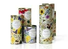
Crabtree & Evelyn’s traditional rebrand
Rebranding a traditional product line, like Crabtree & Evelyn’s luxury foods range, does not necessarily mean updating packaging with flashy new graphics.
C&E’s old-fashioned aesthetic is key to its identity and important to its customers. So when Smith & Milton was contracted to create a new line of packaging for the company’s teas, preserves and biscuits, the design agency looked to the company’s past to find its future.
Smith & Milton explored C&E’s archives to discover a host of picturesque, colourful illustrations. The agency repurposed these illustrations to decorate food products in a way that brings to mind the tranquility of country life.
These designs were combined with premium biscuit tins, gift boxes and glass jars to flesh out the sense of understated luxury that is core to the Crabtree & Evelyn brand.
"Smith & Milton delivered an inspired solution to a tight and challenging brief. The design takes the richness of our heritage and plays it back in a delightful, quirky new way," said C&E creative director Kate Shaw of Smith & Milton’s work on the project, which was shortlisted for a Design Week award and a prize at the UK Packaging Awards 2011.
Renshaw – ergonomic pouches
Described as an "eye-catching pouch" and a "cleverly designed pack" by the Starpack Award judges, Renshaw’s Simply Melt Pouch scooped one of the silver awards in the food and beverage category in September 2011, riding along on the current success wave of | pouches used in food applications.
Even though pouches have been in use for decades now, the judges praised Renshaw’s pouch for its functionality and smart design.
Its creators, the designers at Clifton Packaging Group, claim the pouch has an ergonomic design that allows for safe handling when its contents have been heated.
Moreover, the matt finished colours of the package stand in pointed contrast to the gloss areas that highlight logos and product information.
The pouch has been designed and printed at the same Clifton facility in the UK as the company promotes itself of being a full finishing agency. The pouch has also been shortlisted in the WorldStar Packaging Awards 2011 / 2012.
Amcor’s aluminium innovations
Aluminium cans and cups have formed a major part of the food packaging landscape for decades, but there is still room to refine the application of this material to make life easier for consumers.
In April 2011, Australia-based multinational packaging company Amcor launched a new range of aluminium bowls called Canny, incorporating the latest environmental and design advances in the area.
The wrinkle-free, thin wall Canny range, which has a fully printable surface, has been designed to address the traditional concerns about aluminium food packaging.
The bowls have an easy-to-peel membrane that does away with the inconvenience of can openers and leaves no sharp edges once opened, meaning it’s suitable for consumers of all ages. The bowls are also 30% lighter than standard ring-pull bowls and can stack compactly for more efficient transport, saving costs and emissions when it comes to distribution.
The Canny range is also free of bisphenol A (BPA), an organic compound that has been raising health concerns for the last few years.
"The success of Nespresso with aluminum pods in the single portion coffee business shows us the ability of aluminum to combine an unbeatable product protection with a fantastic eye-catching effect," said Amcor Flexibles Europe & Americas marketing and business development manager Bertrand Jannon on the range’s launch.
Ella’s Kitchen – child-centred design
In the crowded market of food packaging it is significant that a product appeals to its target consumer in both a visual and functional way, particularly for specialised products such as children’s food.
UK-based food company Ella’s Kitchen has made this its credo since its beginnings in the early 2000s. The company’s founder Paul Lindley believes the packaging has proved crucial to the brand’s success.
The recyclable and chemical-free pouches and cardboard packages feature a simple design in vivid colours with childlike drawings and big, bright fonts, using names such as ‘Yum Yummy Cookies’ or ‘Nibbly Fingers’.
"We think it’s important to always approach things from a child’s point of view. So we’ve taken simple, natural ingredients that ooze goodness and created baby foods and packaging that should really connect with kids – with flavours, colours, textures and even names that will appeal to all their senses," Lindley told Packaging Today in September last year.
For parents on the other hand, the package shows nutritional information in a clear format at the front of the package, combining necessary details with an eye-catching design.
By Elisabeth Fischer and Chris Lo
