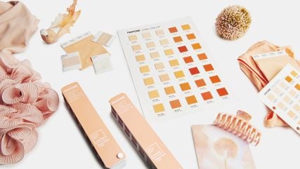
Colour is the first thing the human eye notices about any form of packaging, and it is no exaggeration to say that Pantone is a leader in this space.
2024 marks the 25th anniversary of Pantone’s Colour of the Year programme, with this year’s colour, Peach Fuzz, described by the company as expressing “kindness, compassion and connection”.

Discover B2B Marketing That Performs
Combine business intelligence and editorial excellence to reach engaged professionals across 36 leading media platforms.
The programme influences development and purchasing decisions in packaging design, no matter the sector. Healthcare, food and cosmetics packaging all use global colour trends that are set by Pantone.
The colour of packaging has an intense effect on consumer behaviour. Bespoke packaging manufacturing company James Cropper previously told Packaging Gateway that during times of unrest, such as the global pandemic and the ongoing war in Ukraine, the industry may look towards using more stable and positive colours.
Younger consumers are naturally drawn to bright and eye-catching hues, while for older customers, GlobalData’s consumer analysis finds that aesthetically pleasing colours enhance the online “shareability” credentials of packaging, which is crucial in the digital age.
Pantone has been guiding colour standardisation for print and packaging since 1963. The company’s product manager of graphics Joyce Stempowski has been speaking about the “crucial” position it occupies in the industry, and revealing more about Pantone’s role in bringing colour to packaging.
Pantone’s guidance on colour
Stempowski explains that as consumer-packaged goods gained popularity, colour standardisation became essential for brand identity, and Pantone became “the go-to colour standard in the US”. This continued as economies and manufacturing scaled up globally.
“Over the years, Pantone has expanded its colour selections and now also offers counterpart digital colour solutions for more comprehensive application within packaging.”
As a trusted source for standardised colour solutions, Pantone offers a wide range of tools and services for packaging design and production.
The company has since moved from physical to digital tools, supported through the licensing of the Pantone Matching System. This software is used to design, assemble, proof, formulate and control on-pack colour.
The company’s direct offerings include Pantone Connect and PantoneLIVE. The latter is the cloud-based colour management system described to Packaging Gateway by company insiders as the “DNA of colour”. It is used to address “one of the bugbears of the packaging supply chain – that colour perception is different all the way down the line.”
Stempowski highlights the Pantone Formula Guide, which “provides 2,390 spot colours … traditionally used by brands to enhance colour on-shelf. The guide displays the printed colour reference and a starting offset litho ink formulation to achieve that specific colour anywhere.”
The guide is produced with best-in-class tolerances to maintain colour appearance and achieve colour accuracy and consistency. The master digital colour data behind it has been standardised since 2010 for consistent colour across all applications and mediums.
The importance of colour standardisation
According to Stempowski, it is essential for brands to maintain standardised colours on their product packaging displayed on-shelf, as “colour consistency is a key component of brand equity.
“A consumer may mistrust a brand if they see significant colour variation on the shelves, leading them to question the quality of the actual product or possibly consider it an imitation of the original product. This could ultimately lead to a decline in sales.
“Today’s fast-paced consumers expect to find the same product and packaging look and feel no matter where they shop – be it at a mass merchant, a grocery store or a drug store anyplace in the world.”
Pantone’s influence on packaging trends
The latest trends in packaging across the globe are sustainability and an emphasis on simplicity in design and construction.
In response to this, Stempowski states that Pantone has recently switched the production of guides to base inks that are plant-based and more environmentally friendly.
The company has also reduced the number of base inks required to produce spot colours in the Pantone Formula Guide from 18 to 11.
“This reduction helps in using fewer raw materials and carrying less material by ink suppliers and printers. It also makes designers feel good about the way they produce their work.”
The future of colour in packaging
Pantone keeps up with and provides colour solutions for the latest packaging design trends.
Stempowski asserts that the future of colour management in packaging “is heading towards more automation and digitalisation.
“Pantone is prepared for this by investing in new technologies and tools such as digital colour matching systems and cloud-based colour management solutions.”
With its combination of trusted influence built over decades and the use of emerging technologies, the future relationship between Pantone and the packaging industry looks colourful.


