Jell-O, the beloved dessert brand under the ownership of Kraft Heinz for 178 years, has introduced its first revamped logo and packaging in a decade.
This rebranding effort aims to establish a fresh visual identity that connects with both the current and future generations of parents while still honouring the brand’s rich legacy.
New design reflects a bold and playful approach
The updated design features matte block letters, with a white shade to add dimension and an angled ‘O’.
To highlight certain products with zero sugar, the packaging includes impressionist depictions of its fruit flavours on the right side.
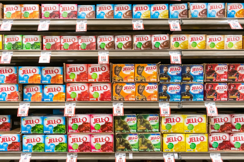
This modern approach stands in stark contrast to the previous design, which showcased glossy, narrow lettering with a handwritten-like ‘O’ and presented the product offerings as a checklist along with literal photographs of fruits.
Despite these changes, the distinctive red lettering and emphasis on the ‘O’ maintain the brand’s instant recognition.
Jell-O’s vision for the future
Kraft Heinz associate director of desserts Kristina Hannant expressed the brand’s vision, stating: “As ‘America’s most famous dessert,’ we aim to transcend generations and want to continue bringing our customers on a never-ending flavour journey.”
The fresh packaging, characterised by a bold, playful and wonder-filled approach, will be available in grocery stores starting this July across Jell-O’s entire product lineup.
Reimagining the brand for the next generation
The rebranding project was undertaken by BrandOpus, known for working with prestigious clients such as Molson Coors, Panera and McCain.
BrandOpus creative director Rebecca Williams shared insights into the process, saying: “With the Jell-O renovation, we’re bringing back the jiggly fun and harnessing the wonder that the brand brings to adults and kids alike.”
The aim was to create an imaginative and playful brand world that resonates with the new generation of parents, offering inspiring and wonderful experiences in their everyday lives.
The new design elements and iconic logo are expected to unlock exciting possibilities for the brand, propelling it confidently into the future.
Continued innovation in branding for Kraft Heinz
Jell-O’s rebranding marks one of Kraft Heinz’s efforts to revitalise its brands and packaging strategies.
Over the past three years, 18 brands, including Kraft Mac & Cheese and Shake ‘N Bake, have launched new brand foundations and packaging architectures.
Kraft Heinz’s commitment to staying relevant and sustainable has been reflected in these recent updates and its continued focus on enhancing the appeal of its products to consumers.


